Themes
Doctave provides a number of ways for you to customize the look and feel
of your documentation with your doctave.yaml file.
You can customize your color scheme, your theme's roundedness (border radius), your logo, and favicon.
Colors
Your theme is customized in your project's doctave.yaml project file.
theme:
  radius: small
  colors:
    accent: "#F76B15"
  logo:
    src: _assets/logo.svg
    src_dark: _assets/logo-dark.svg
  favicon:
    src: _assets/favicon.ico
Accent and grayscale
Doctave will generate a 12-step color scale from your brand accent color for your docs. This scale will be used in different parts of your documentation.
You can also specify a matching grayscale, which subtly changes the background and monochrome elements of your docs:
grayis the default grayscale, and works with most colorsmauveworks well with red and purple colorsslateworks well with blue colorssageworks well with teal and green colorsoliveworks well with lime and green colorssandworks well with yellow and orange colors
theme:
colors:
accent: "#F76B15" # Specify an accent color
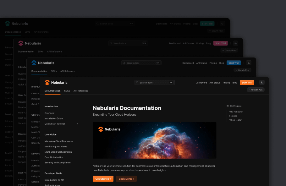
grayscale: sand # And a matching grayscaleDark mode
Your docs will automatically compute a matching dark-mode color palette for your documentation.
If you want to disable either light or dark mode entirely, you can use the color_mode field:
theme:
  color_mode: "dark"  # Dark mode, always
Border radius
You can override the border radius of the elements in your docs with the radius field. This will impact the roundedness various elements of your documentation.
Here you can see the impact of changing the border radius on buttons:
The default radius is medium.
theme:
  # Must be either full, large, medium, small or none
  radius: full
Logo
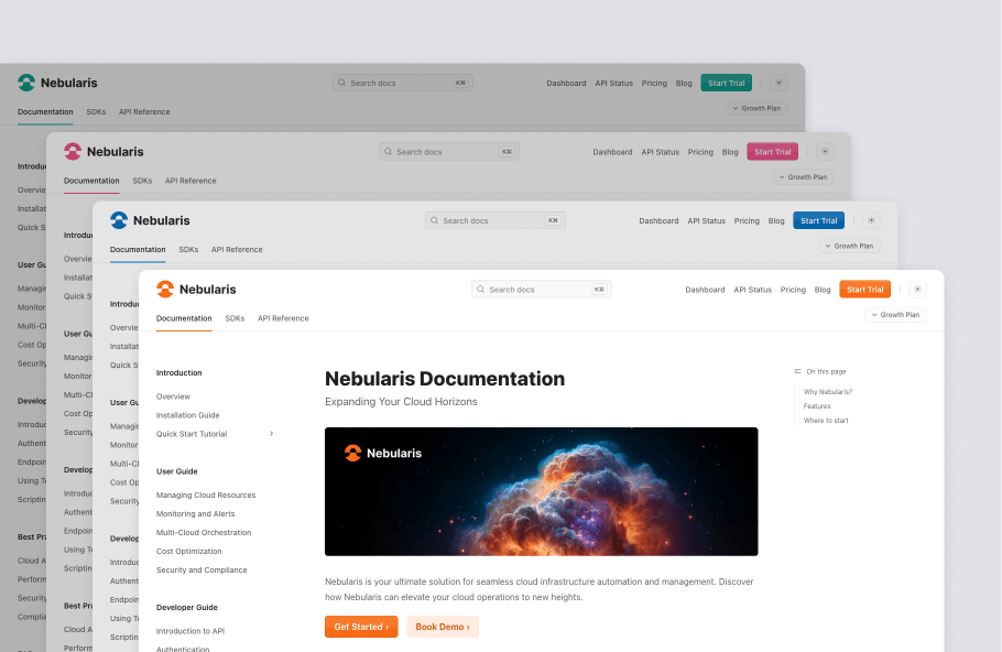
You can specify a logo to show in the top left side of the page header. You can customize the logo in both light and dark mode.
logo:
  src: _assets/logo.svg
src_dark: _assets/logo-dark.svg- The logo must be located under the
_assetsdirectory. - We recommend that you use
svglogos, but also supportpngandjpegformats.
Favicon
You can customize the site identity further with a favicon. The favicon is shown in browser tabs and bookmarks. To set up a favicon, you need a favicon file. You can use an online generator or pick one from your existing brand assets. Recommended file formats are svg or ico.
favicon:
  src: "_assets/favicon.ico"