Doctave Components
Doctave comes with a built-in library of useful components to make your documentation more accessible and dynamic.
Component Library
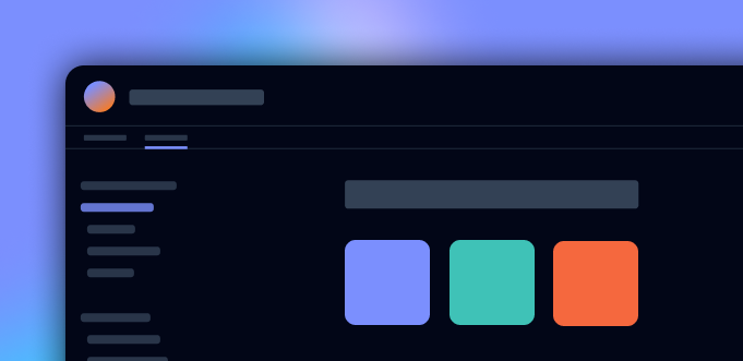
Doctave's component library are split into 2 groups: UI components and layout components.
UI components are visual components like <Button> or <Icon>, while layout components like Grid or Flex are used to structure content and other components on your page.
You can explore all our various components using the sidebar on the left.
Syntax
Doctave's component system takes it syntax inspiration from MDX.
MDX-inspired syntax
<Flex gap="3">
  <Button href="/">Get Started</Button>

  <Button href="/">Read More</Button>
</Flex>
The syntax is easy to read and familiar to anyone with an understanding of HTML, and integrates perfectly with traditional Markdown.
Explore the syntax ›Custom reusable components
You can also create your own reusable custom components with custom CSS to create unique reusable components.
Custom Components ›